Metal Head X Limbo Miniatures : Bust Project POST 04


Definitely a long time coming!


But the official protoype pictures are up!

Honestly this wouldn't be possible without having Artstation as a platform to share the original concept art in  the first place. In a strange turn of events- my lame attempt at trying to make my dream of creating my own collectible by drawing it out- actually came true!

i'm not sure if the blog allows for a Kickstarter link- so i'll just avoid it since you can get it via my main AS page regardless.

Thank you all for following my journey so far- the next update should be pictures in China once we hit production.

here are some BTS video of me playing with the protoype


and pictures!


Bonus shot with a packaging mockup - it is NOT final as I am a rather subpar packaging designer.


Report

Metal Head X Limbo Miniatures : Bust Project POST 03


What's up everyone- sorry about the lack of updates on this; but i was hit with chicken pox and was out for an entire week. Happy to have recovered and be able to put that behind me.

A pretty cool update this time around. We have some 3d print prototype pictures directly from the factory in China. it also show the size and scale of this bust to be rather substantial for a miniature. it'll stand at about 140mm. So it'll make a rather nice desk dispaly collectible indeed.


and on another note- here is the color reference for our prototype painters to work on. The master will serve as a guide for all the production pieces.


Thank you for the taking the time to read this- and I hope you're excited about this product as much as I am!

Cheers!

Report

Kollective Learning Ep 05 : BONUS : Lunar New Year Card


Hello there!

It's the holiday season for those of us celebrating the Lunar New Year tradition; So I apologize for lack of a blog update. This episode is more of a bonus where I highlight my thought process when it came to composing my annual Lunar new Year painting.

please note that this is not a step by step per se to creating an illustration. there are already numerous great works that highlight this on Artstation alone. What i aim to share is key check points in my painting- and what I was looking to achieve at each stage. They are not chronological when I was working on it- but these points were constantly in my head as I was creating the artwork.


01 - Idea sketch


I generally keep my sketches extremely loose- as it's really more for an experiment and reference point for my painting. I tend to do extremely rough and quick drafts like this for personal paintings. However before I even grabbed my pen- i spent a few days "sketching" in my head. imagining compositions, ideas and layouts. I knew I wanted to have the subject matter be that of a Boy and his dog- as the year 2018 is believed by the Chinese to be the year of the Earth Element Dog. 


02 - Planning Composition


I love centre compositions- and use them often in my work. It's very much a personal preference- but I find them very simple and effective. The diamond composition tool is a simple way of finding you main focus of the composition. In this case I had the boy and his giant goofy dog- along with the secondary element of the STOP sign which carried the meaning of the illustration.

Another thing I enjoy playing with composition is creating frames within frames. I found an easy way to pull this off by repeating the background arches into the distance. This not only helps with depth- but in reinforces the main subject framing


03 - Value Structure


With my simple single point perspective and straight ahead composition, i could structure a simple depth driven backlight value structure to the painting. Establishing this early is great to keep your color values in check- as well as your knowing where to address the level of detail. Once again- my goal was simplicity.

Under your Photoshop settings- there is an option called "Threshold" (Image > Adjustments > Threshold) which is a great way to check how your values are working together at any phase of the painting.

04 - Color Structure


I knew that I wanted the color red to be the main color in this piece- as it was the traditional color of the Lunar New Year celebrations. it's important to establish your main color early- Either for storytelling purposes or just for sheer preference; it simplifies the decision process much much earlier.  Beyond this, it also reminds you to maintain the full purity of the said main color- and all the other colors you introduce should only serve to balance the painting and not interfere with the main color.


05) Storytelling


Regardless of how simple the message is- it's great to put as much care as you can to visually indicate the story behind the picture. In this Illustration- the main message is blatantly obvious as the boy is actually writing the words down! However what i was looking to hint was also a quiet rebelliousness and just the innocent connection of a child and their pet. A small bonus on the environment was also the visual cue that the structures on the left are from a modern setting vs the structures on the right is a more traditional architecture. 

And that's really it!

once again- thank you very much for reading; and I hope you've found it interesting and informative!

Happy Lunar New Year! 

新年快樂!


Report

Metal Head X Limbo Miniatures : Bust Project POST 02

Hello there!


Another upate on the Metal Head miniature bust; we've completed the zbrush sculpting phase and will move on to 3D printing and tooling soon.

Here are some progress shots of the zbrush sculpt- and my notes and paintover for the 3D sculptor.

As you can see the sculptor, Ed Zhang did a really good job transferring my loose sketch into a working model.

However, onething i'm looking to push for in all my Metal Head busts is some kind of continuity in the swooping curves and lines. Taking inspiration from product and car designs.


a small back end tweak where I shifted the eye position and size. Definitely want to reduce any bug eyed issue with the sculpt.


A very very low res render from keyshot- just to test out the potential materials for a fully colored version. The plan with Limbo MIniatures is to release a pre-painted and unpainted kit. However both versions will have the clear Dome face cover. We are also figuring ou the possiblities of adding LED lights to the eyes. Finally, the wood box is just for reference- the final product is only up to the lower base.


And some decent renders from Keyshot with all the neccessary trimmings. Please forgive the early shader work.

www.limbominiatures.com

www.jaroldsng.com

Stay tuned for more

Cheers!

Report

Kollective Learning Ep 04 : Frequency of Focus

Hello there!

Here's an interesting topic i'd like to share in this post. The idea of Focus came to me when I was catching myself getting lost in the numerous details of my artwork. I studied various art and designs; and majority of the designs that i do love had a very clear- focused design; despite being well rendered and detailed.

The system that i developed is called Frequency of Focus- by breaking down your design goal to a series of visual elements; you can isolate them according to priority- and bump up their visual clarity.

Here's an example

This is a picture of a Knight I grabbed online. It'll be a great example of a working- well executed design. However- if we start to isolate the possible visual elements from this design; we can get 4 main elements. the wavy line i've created represents the visual interest frequency of each element. Because they are fairly the same frequency; you could say that the design lacks focus or rhythm.

So with that in mind,


here are 4 examples where each visual element is highlighted visually- creating a new design of the Knights armor altogether.

Sword Focus

By putting the sword as the main design focus- i've reduced all detail and visual value of the remaining 3 elements. This in turn creates a knight design that looks a little more working class, expendable, battle orientated. Not the greatest design- but the goal was to establish clarity.


Here are practical design examples using this direction

Cloud Strife from Final Fantasy VII & Guts from Berserk

Helmet Focus

Here's the same design with more focus on the helmet.  By pushing the decorative elements on the helmet and  minimizing the sword and shield- we start to see a more regal, commanding approach to the design. 


Here are practical design examples using this direction

Judges from Final Fantasy XII

Shield Focus

Similar to the Sword focus design, i've reduced all the remaining elements and have made the shield the main weapon instead.


Here are practical design examples using this direction

Tower Knight from Demon Souls

Emblem Focus

Taking the lion crest emblem from the initial knight design- i've repeated that element throughout the armor; creating a detailed and lion commander design. In this case- the emblems we actually embossed and stamped unto the armor. However this point can also be reflected in the color, fabric choice and even logos.

Crusade Knight and King Llane from Warcraft the Movie


In conclusion


So obviously each design assignment will have it's unique challenges and require a unique approach to it. This design approach using focus is a fun way to force yourself to isolate the main idea from your original design. It's a great way to also explore options when you're tasked at brainstorming various ideas in a design sketch phase.

On top of that- by applying the Non Linear referencing and the Why theory from my previous blog posts; you can get some very interesting results!

once again, I apologize for grammatical and spelling errors; I'd like to thank you for taking your time to read this and I hope you've gained something from it. Happy creating!


Cheers!

Report

Kollective Learning Ep 03 : Who, What, Where, Why?

Hello there!


Today's post will cover the topic of designing with intent; using a rendition of the tried and true formula of Who, What, and Where. But- we will be adding on an additional WHY, and i will try to show how much that affects your designs.

The Who What Where (WWW) system is a great series of questions to ask before embarking on your design.

Here are some ways of how they are broken down to

WHO

WHO refers to establishing the current designs origin and appearance. 

  • - Age
  • - personality
  • - origin
  • - maker

WHAT

WHAT refers to the usage or function of the design

  • - occupation
  • - function
  • - purpose

WHERE

WHERE refers to the curent location of the design

  • - position
  • - geography
  • - climate
  • - environment


The Who category best decribes characters; The What category best describes machinery; and the Where category best describes locations.

However, I strongly believe that good designs should have all categories fleshed out well- for example a Trash planet Recycling Robot whos curious and loves to watch soap operas (Wall-E) would be a great character description despite being a machine.


Now these Three categories are sufficient to start on creating an interesting design- but lets talk about the fouth category; the WHY factor.


WHY

WHY refers to the goal and purpose of the design- it's on everyone's mind that an artists goal is to create an appealing image; but the Why factor needs to be bigger than that. The Why factor looks into the broader scope of the project, from it's targeted market appeal, to it's story arc and needs.

for example- the Why category focuses on points like these

  • - how does your design fit the needs of the story emotionally?

Beyond occupation or personality; asking yourself visually- how complicated or simple should the costume be; or how vibrant or dull a design should be based on what emotional story arc the design is planning to service.

  • - what do you want your audiences to feel?

You can generate a strong response from creating design outlooks that either relate or alienate your expected audience. Depending on what is your goal for the project- both are suitable strategies.

  • - what emotion is your design trying to reflect on?

This being very similar to Episode 2 of the Kollective Learning blog; where we talked about how all designs can be boiled down to a core emotion or response. Fear, happiness, sadness, disgust, empathy and more.


DEMO

In this example- I asked the classroom for a Who, What, Where response. The decription that we came up with was the following.


A stoic woman astronaut who struggles to pay rent repairs spaceships at a Meteorite gas station.


Who - A stoic woman astronaut who struggles to pay rent

What -  repairs spaceships

Where -  at a Meteorite gas station.


In this class demo- i did two sketches to explore this design but with two seperate WHY factors.

WHY factor 1 - was to portray the struggle and difficulty of coping with challenges

WHY factor 2 - was to portray the hope and optimism in people that are struggling.


Outcome 1

The Astronaut suit was designed to be much bulkier, heavier and here general gesture slumps forward. Her equipment blocks her view and hinders her movement. The emotive keywords were - Restrained, Tied down, Heavy


Outcome 2

The astronaut suit is still clunky- but much more form fitting in certain places. Her visor flips up- showing that she chooses to view the world clearly. Her gesture is more upright and optimistic.


Comparing both Outcomes


So in drawing terms- The Who, What and Where are similar

  • - both are wearing some kind of astronaur suit
  • - both have a welding visor and mechanical tool arm to suggest repairing
  • - both are female and of similar age


But due to the Why differences- the outcomes of the designs vary substantially. This is becuase the intention and emotional outreach was a different goal. Design 1 was made to evoke a sadder outlook at the character and Design 2 was made to evoke a more optimistic approach.

There are some unique design elements that help push that idea further too

  • - Design 1 has criss crossing straps to look like restraints, and boots that lock into the ground when she does repair work
  • - Design 2 has a visor that is inspired by a race car helmet- and wheels on her boots to make her move quicker during repairs.


This is a very fun way of looking at design; and i would recommend focusing more on the big WHYs. The whys to me are the big and bold What if questions- that are meant to provoke and inspire.


Design a tank that is the Ferrari of tanks

Design an optimistic Undertaker

Design a gym for lazy people


Thank you so much for taking your time to read this! 

I apologize in advance for the grammar errors and sentence structures. A side goal for me via this blog post was to improve on my writing abilities by writing more. I do hope you have learnt something from this. Happy creating.

cheers!


Report

Metal Head X Limbo Miniatures : Bust Project POST 01

Hello There!


Very happy to share progress updates of a new project of mine. It has always been a dream for me to create physicalproducts from my designs- and I'm glad to have been approached by Limbo Miniatures to make that vision come true. I will periodiaclly update the production process of the piece here in this blog. Hopefully it'll be a fun sharing of how Miniature Busts are produced and created.

Limbo Miniatures is a cool miniature producer based in New Zealand; and you can check out more of their products on their website

https://www.limbominiatures.com/

The Design


The Design that was selected was "METAL HEAD 03". The plan was that the gold skull, and the possibility of the clear resin face dome would make a cool bust to own. After an initial sculpt was created- I drew a turnaround to better flesh out the design; however- I did want to give creative freedom to the zbrush artist to interpret the design themself.

Below is the intial blockout sculpt.

It's clearly an early sculpt; but was extremely usefull to highlight proportion challenges and design gaps from the initial concept art. One thing I do love about zbrush sculpts is how early you can spot weaknesses in your designs. From here on- I did drawovers and sculptovers to experiment with better proportions and design lines.


 Next Update!

We will work on the porportions further- and start to nail the details from the original concept.

Once again- Thank you you for taking the time to read this, and i hope you've found it usefull and interesting!

Report

Kollective Learning Ep 02 : Art Direction Part 2 - Linear vs Non Linear Inspiration


Hello there!

In this segment of the Art DIrection series; i'd like to bring up the topic of image referencing and inspiration gathering techniques that you would embark on before creating a design. This could be during the earlt brain storming Phase or even during later Stages of the Design. I will share my  mindset to have when approaching this and show an example of them in action.


The classic reference or mood board has a series of images that inspire an artist to take it to the next stage of the creative process; but it is also used to inform and communicate the ideas that are in the creative's head before they start executing the design. 

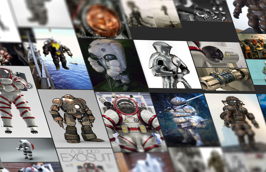
Here is an example I created for one of my previous projects - and using the pureref software to compile it.

https://www.pureref.com/

In this example- my goal was to find interesting references for a retro diving suit and to combine it with a plated knight armor. By scouring through pinterest boards, Google images and even Artstation- I hand selected these images that I personally felt would be cool on my design. 

However,

The downside of this approach was that my angle of research was very linear; as well as shallow. I was relying purely on instinct and current tastes to dictate my selection of references.


So, in light of this situation- i've developed two mindsets to adopt when tackling the challenge of creating useful references.


The methods are

1) Linear or DIrect References

2) Non Linear or In-Direct References


1) Linear Referencing


Linear references are visual and descriptive information that provide direct information of how a design should look like. These references reflect the real world and are there to assist the believability of your design.


- Linear references are images that help you lock the laws of the universe you are designing for.

- Images that help solify and make believable the world that you are designing for.

- help inform you on missing details and minute elements that are present in the real world.


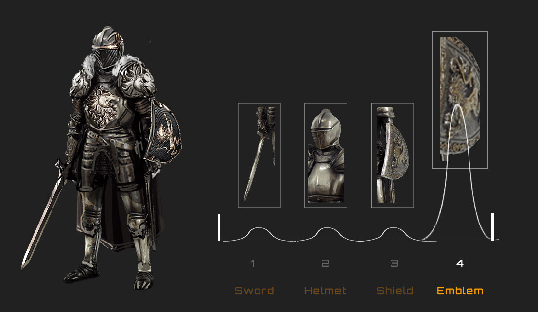
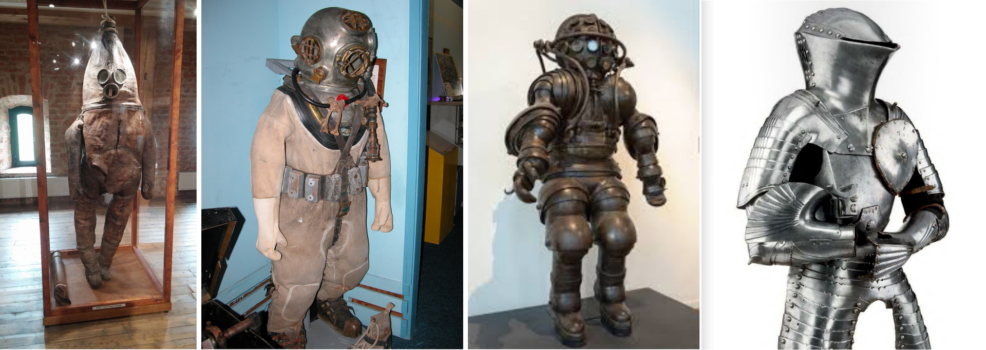
Example- for the Diving Knight suit; a more appropriate linear reference would be images that explained the construction of the suit.


2) Non- Linear Referencing


Non-linear references are visual and emotional information that help guide the subtext or hidden meaning of your designs. These references can be in-direct in terms of the realm, world or subject- as the core purpose is to evoke a certain psycological feeling.


- Non linear references target human emotions, the end feeling of your audience.

- focuses more on subjective terms like personality, character and meaning.


Example- for the Diving Knight suit; a more appropriate non- linear reference would be something that evokes the feeling and mood of the intended design. in this case; a sense of weaponized pride and purposefulness- as well the pursue of intellect and ability versus size and strength.

you can view the final artwork for the Dive knight design in the link below

https://www.artstation.com/artwork/0va88


CASE STUDY


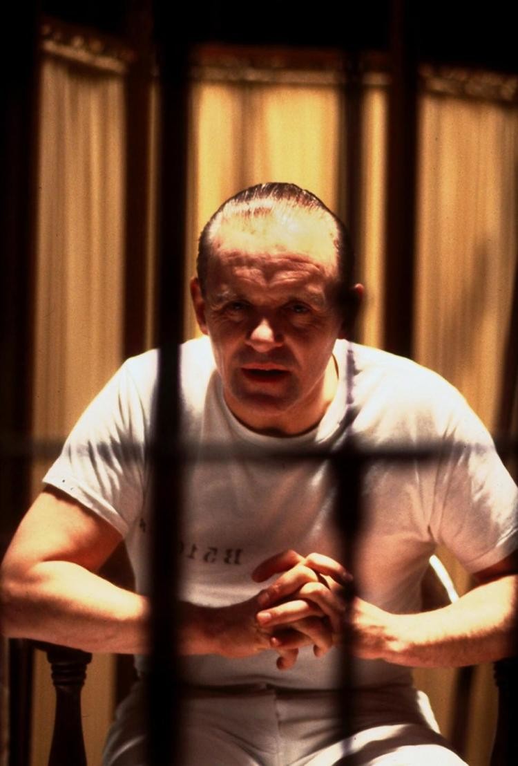
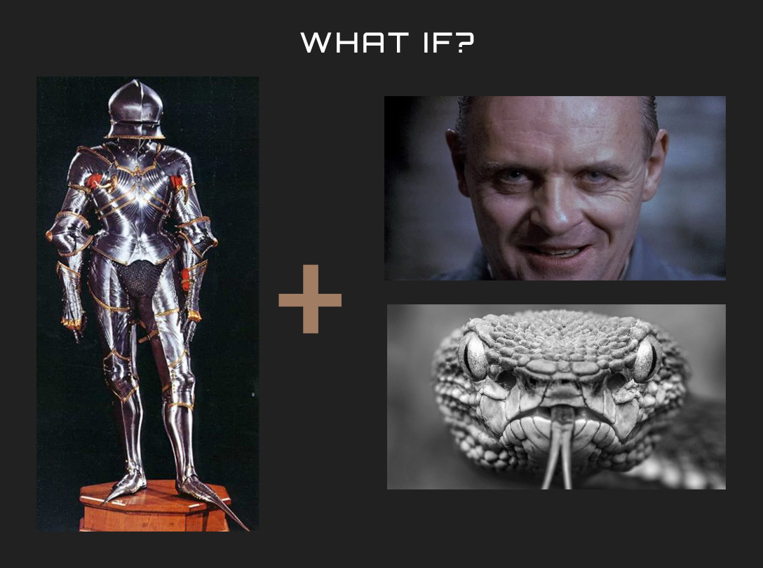
Hannibal Lecter Design from the 1991 film - The SIlence of the Lambs; Directed by Jonathan Demme

production still from the film

The character of Dr. Lecter from the above mentioned film was portrayed mastefully by Sir Anthony Hopkins- a calculative, scheming and violently unpredictable serial killer who had a taste for manipulation and human flesh.

Now- if we were to reverse engineer this design; we can start to unpack it into to sets of visual references or moodboards. One being Linear references, and the other Non-Linear references.


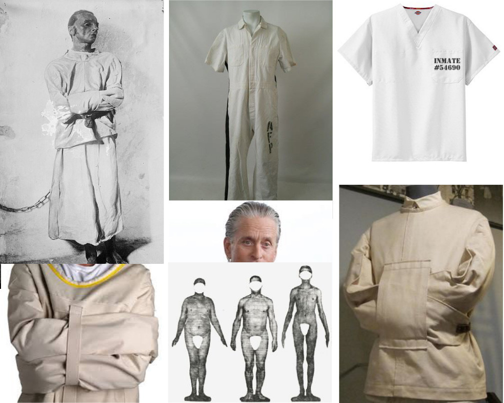
Linear references for this character design would be images that help explain his visible physical conditions- things that we can see and understand immediately to make him plausible as a real character. 

- his age, body type, built

- his current outfit choice

- timeline and world that he resides in

- his occupation (in this case, an imate in a maximum security criminal asylum)


example of a Linear reference sheet for the character design

These references are incredibly useful to solidify the position of him in the world we are trying to sell to the audience; it also allows us to understand where he is currently in the timeline of the story. 

However; there is still little or no information on the personality and character of Hannibal in any of these references.


For that- we'll have to look deeper into the symbolism of his character. 


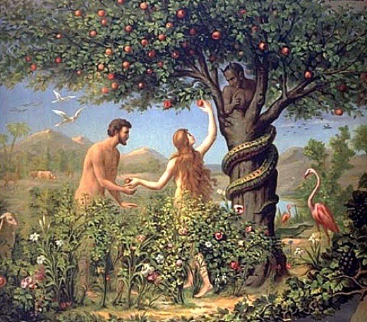
In the Film, the protagonist Clarice Starling- played by Jodie Foster; must interview Hannibal- with hopes of him shedding some light on the psycological profile of an unknown serial killer. Doing so- she exposes herself mentally to Hannibal's mind games. Exchanging stories of her troubled childhood and vulnerability for his insight.


The relationship could be symbolized as a modern telling of Adam & Eve and the Forbidden Fruit. Where Clarice (Eve) who wants information (Fruit of knowledge) by confronting Hannibal (The Snake).


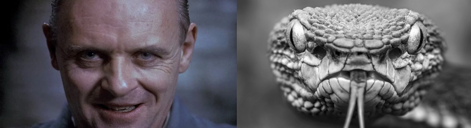
Hannibal's entire movements, acting, personality derives from the calculate and predatorial movements of a snake. Not just a snake in the biological sense- but more importantly in the emotional sense. Most people are afraid if not cautious and respectful of a snake. Tapping into this universal psyche; portraying these elements in the demeanor of the character Hannibal creates a human character that undoubtly feels predatory.


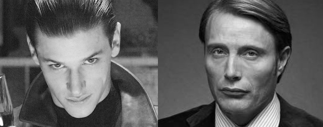
Now compared to other portrayals of Hannibal in the later films and Television series- there is a much different emotional language being expressed. I would digress that although these renditions of the designs were suited for their respective story arcs and media formats- in my opinion, they did not have the same design purity as the one portrayed in The Silence of the Lambs.


Gaspard Ulliel from Hannibal Rising 2007  and Mads Mikkelson from Hannibal TV Series 2013-15

In Resolution,

I believe that good designs- irrespective of medium, formats or styles; should evoke both linear visual ques and non-linear visual ques to be succesful. 


Moving forward- it'll be interestings to see what design posiblities when you take this approach to designing and establishing Art Directions.


Cheers, 

and thank you so much for taking the time to read this! 

Report

Kollective Learning Ep 01 - Art Direction Part 1 - The Broad Definition

Hello there!

There are plenty of definitions around the web describing what is Art Direction, and i'm sure many artists stand by their own definitions of it. In this post, i'd like to take time and establish my base understanding of this broad term and  to hopefully give you bite-sized definitions of how to look at it. As I mentioned before- these are my views and understanding of it so far! 

without further ado- here is blog post 01;


What is Art Direction? (Part 01)

       Art Direction is the series of informed and Intuitive creative decisions that are in service to the visual language of a project.


Now, the keys points i'd like to stress on are- 


Informed and Intuitive; so let's upack these two points.


A) Informed Creative Decisions

As the name states, all informed creative decisions must stem for objective and finite frameworks. I define these factors as objective ones as they are information that should be either gathered, researched or given too ahead of time. I am currently categorizing these frameworks into three areas-


  1. Budget/Time or Medium/Technology Limitations or Needs
  2. Story outline or Game Play outline
  3. Media Tropes or Psycological landmarks


1) Budget, Time, Medium and Technology

Unless its the main project goal of pushing or breaking technological limitations of the time- most projects are bound by the limitation of a budget. I believe any artists should be aware of the time and technological challenges of any project they're on board on. Working within these limits can actually even improve your design sensibilities- as you are forced to take more creative routes to solve a problem.


"Mad Max, 1979 was Director George Millers' dystopian film set in a post apocalpytic Australia. With a modest budget- of USD 375,000.00 it grossed USD 100 Million worldwide. Working with the dystopain timeline and setting; the costumes, vehicles and setting were fabricated from found materials- establishing the lovely gasoline punk look we remember today."


image from MAD MAX ; 1979

2) Story Outline or Game Play

As art direction aims to establish a visual appearance to a film or game; all of it's core values should service the intended reaction of the audience/player. Understanding the core story values of a script or the cory gameplay factor of a video game will greatly bridge the visual decisions made for it. 


"Nintendo's The Legend of Zelda: Breath of the Wild was a new open world take on the Zelda franchise. The muted colors and atmospheric values created a visually stunning art direction that tied together incredibly well with the gameplay and story. "


image from The Legend of Zelda: Breath of the Wild ; 2017

3) Media Tropes and Pyscological landmarks

Character archetypes, tropes, recurring themes are actually usefull in creating relatable content. Although there is a risk of repeating similar themes or subject matters- understanding the landscape and tastes of your audience reduces your risk of alienating them. 

A good design should be easy to read; easy to understand and easy to relate to while still looking fresh and exciting.


"Blizzard's Overwatch took the gaming world by storm when it's fun, appealing and lively characters match it's equally competetive and balanced gameply. Each character is a vibrant accumulation of character tropes- ranging from a wide range of nationalities and traditional character classes."


image from Overwatch ; 2017


B) Intuitive Creative Decisions

Intuitive creative decisions in my opinion are the more in-depth and less obvious routes to look into Art Direction. This mindset approaches more to self reflection and putting more of your own unique values into the project. As with the Informed section; I have broken this section to three categories.


  1. Target Emotions
  2. Your own Flavor
  3. Pushing/Breaking the visual mold


1) Target Emotions

The ultimate goal of any product or story is to connect with the end user or audience. The stronger and more meaningful the connection- the better outcome. So before establishing any connection- we must first set the target emotions we wish our viewer to feel. Looking at the six basic human emotions (anger, disgust, fear, happiness, sadness, and surprise) as a base; any succesful project would have tapped into these emotions at some level. 

Without this emotional targeting- designs might be perceived as lifeless or disconnected with the current emotions of the story. 


"Disney Pixar's WALL-E had the immense challenge of telling a love story between two robots that didn't have any real dialogue. The team succesfully achieved this by extracting the most of a characters ability to act and emote purely through a clever combination of design, gestures, sounds and limited facial movements."


image from WALL-E the game ; 2008


2) Your own flavor

There are some projects where the Art Direction is still vaporous or even when it's partly established- however, it's still missing the x-factor. There are numerous titles and storiesof how one painting or one sketch by an artist tied an entire project together. Most often, the best ideas are the deepest more honest ones; and this includes style and art direction. 


"Artists Nicolas Marlet and Heidi Smith both helped establish the core visual DNA of the films Kung Fu Panda and Paranorman respectively. Each bringing on board to the project their unique taste and approach to form and lines."


image by Nicolas Marlet; Kung Fu Panda

image by Heidi Smith; Paranorman


3) Pushing/Breaking the mold

Every now and then an Art Direction briefing starts with the feared "I want you to create something the worlds never seen before". A near impossible task- but always an intersting endeavor. The most reasonable way to push your design past the media landscape is to stop looking at that very landscape itself; by absorbing deeply more outside content- even surfacely irrelevant ones. Through time and persistence, you will be granted the possibility of a creative miracle.


"David OReilly and Damien Di Fede;s everything game is my example of a mold breaking take at how a video game is to be played and experienced. From the name, the choice of music to the limited animation; aims to simplify the concept of a game to it's atomic level."


image from Everything; 2017

Report

New Blog! - The Kollective Learning Channel - POST #00


Hello there!


With the launch of the Artstation blog; i was looking for a way to make a best of it- and something that would have some value to both myself and the art community.

I've decided to put all of my posts regarding sharing and teaching under the Kollective Learning (KL) banner; as an easier way to keep track of them.

A little back story of me- I'm Jarold Sng; and i've been working in this field for the past 8 years and have been teaching and sharing for the past 6 years. I conduct classes at my Alma Mater twice a week- where I lead the Concept Design subject. Every week; i give lectures, paintovers, and demos to my students as part of their course. Having a blog like this will be a great way for my students to re-review my notes and lectures- plus it'll be something that everyone (hopefully) in this community could get something from.

The name Kollective is used as I want to pursue a free and shared collective learning experience- and anyone who wishes to share me their questions, feedback and recommendations would be really cherished. Please PM here or drop me an email; and i'll work it in to the blog!

Happy learning everyone


cheers!

Jarold Sng

Report